
Boggi Milano
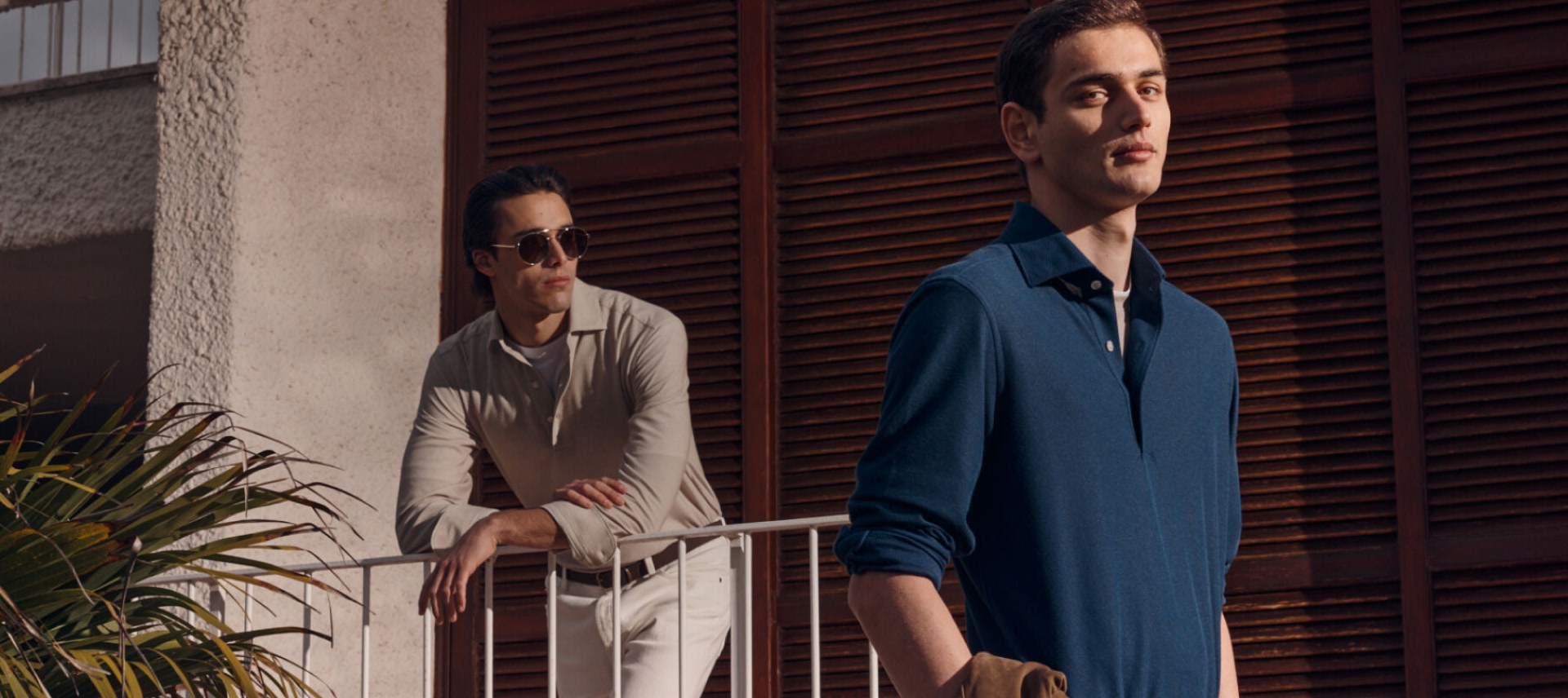
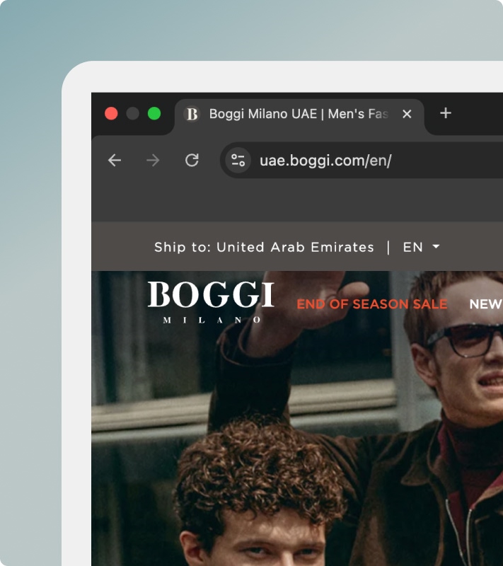
Boggi Milano’s UAE e-commerce website was designed to deliver a refined and minimal shopping experience that reflects the brand’s Italian heritage and premium menswear positioning. The platform focuses on clarity, product storytelling, and seamless purchasing across desktop and mobile devices.The focus was on clean design, clear product presentation, and seamless usability across devices, allowing customers to explore collections and shop with confidence.
Project Overview
Boggi Milano is a premium Italian menswear brand with a strong global presence across more than 60 countries. Known for its refined craftsmanship, high-performance fabrics, and contemporary approach to men’s fashion, the brand blends innovation with timeless style. For the UAE region, the objective was to deliver a localized e-commerce experience that reflects Boggi Milano’s luxury positioning while offering a seamless and intuitive shopping journey.
Problem Statement
Boggi Milano required a localized UAE e-commerce experience that preserved its global luxury identity while ensuring a frictionless shopping journey tailored to regional users. The challenge was to maintain brand elegance while optimizing usability, performance, and conversion.
User Experience Process
A competitive and heuristic analysis was conducted on leading luxury and premium fashion e-commerce platforms to understand best practices in navigation, product presentation, and checkout behavior. Key insights were used to refine hierarchy, layout, and interaction patterns.
Key insights
Optimized product listing layout for scannability \ Clear filtering and sorting mechanisms \ High-quality imagery to communicate fabric and texture \ DClear size selection and availability indicators \Transparent pricing and promotional display
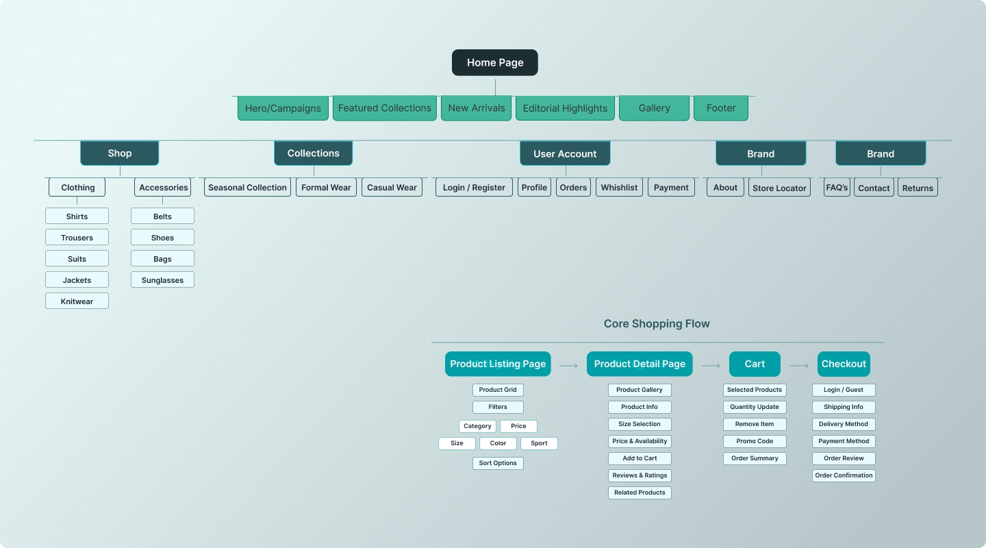
The information architecture was structured to reduce cognitive load while maintaining depth. Categories were grouped logically to help users find products quickly without overwhelming choices.
The architecture focused on
Creating a clear and predictable navigation structure to reduce cognitive load \ Prioritizing product discovery with logical category grouping \ Maintaining a shallow hierarchy to minimize the number of steps to key products
Supporting quick scanning and decision-making during browsing \ Separating browsing, product exploration, and checkout flows clearly \ Ensuring consistent category naming aligned with user expectations
Low-fidelity wireframes were created to define layout structure, spacing, and hierarchy. This phase focused on usability, content flow, and alignment with the minimal design philosophy before moving into high-fidelity visuals.
Wireframes covered
Homepage layout structure and content prioritization \ Global navigation and mega menu behavior \ Category listing (PLP) layout and filtering structure \ Cart summary and checkout flow structure
Design System
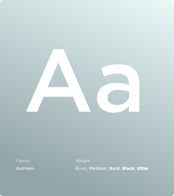
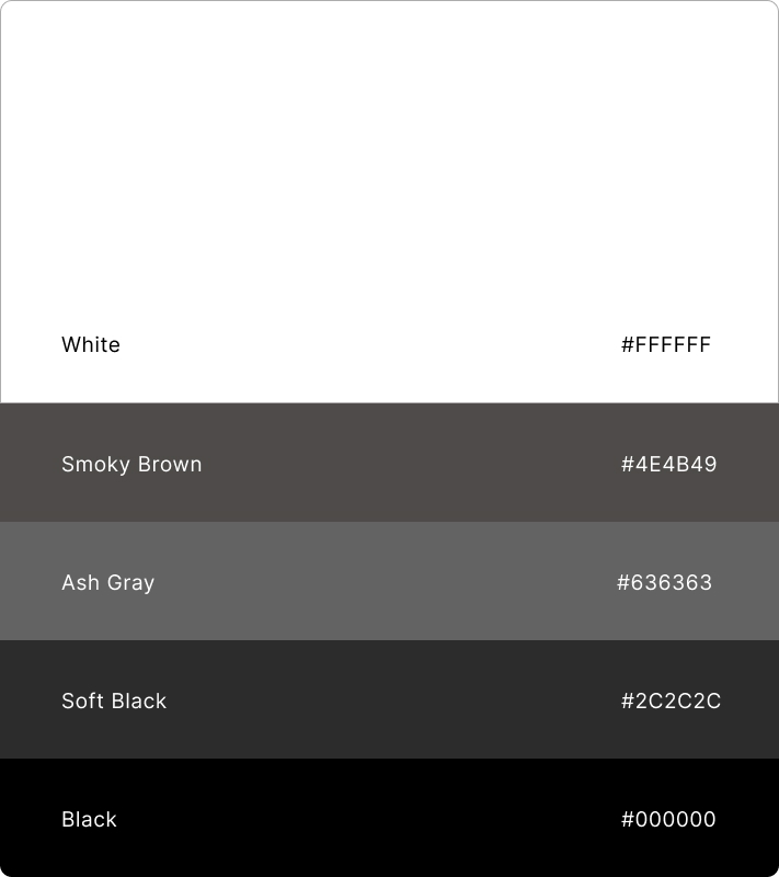
A minimal design system was created to support consistency and scalability using a neutral color palette to enhance premium perception and elegant typography for clarity and sophistication.
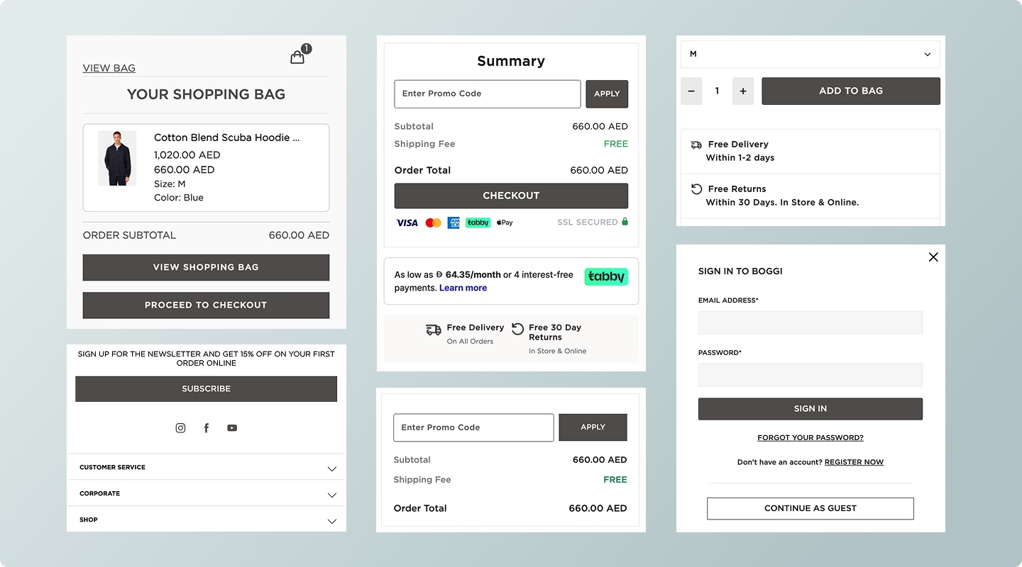
Minimal luxury aesthetic \ Clean grid-based layouts \ Product-first design approach prioritizing imagery and details \ Consistent UI components ensuring cohesive brand presence / Strong visual hierarchy to guide browsing naturally \ Neutral color palette enhancing premium perception \ Refined typography system for clarity and sophistication
UI Design
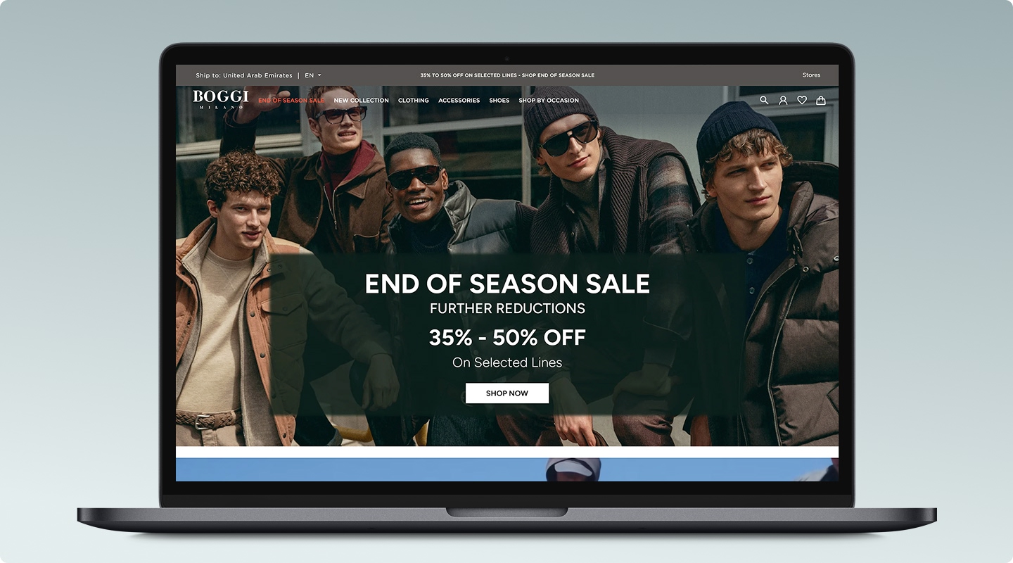
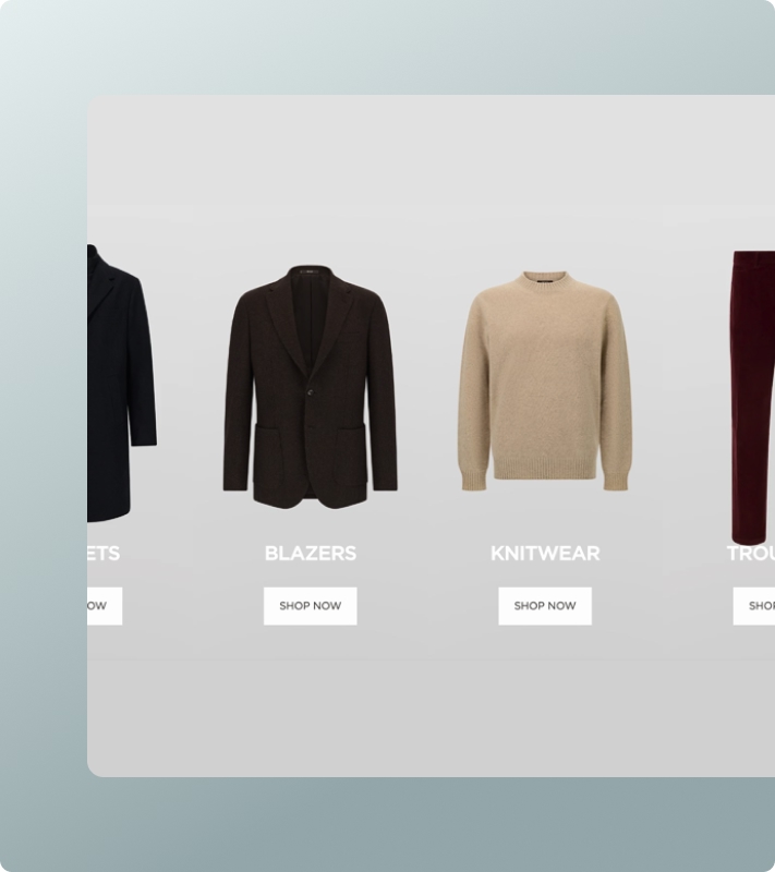
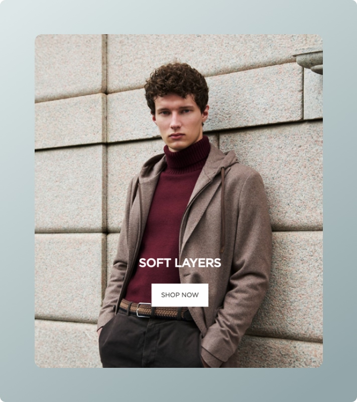
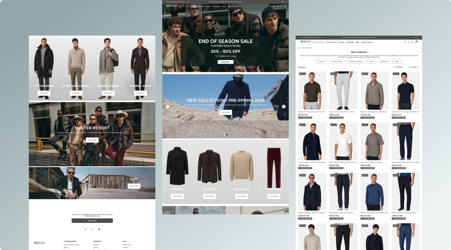
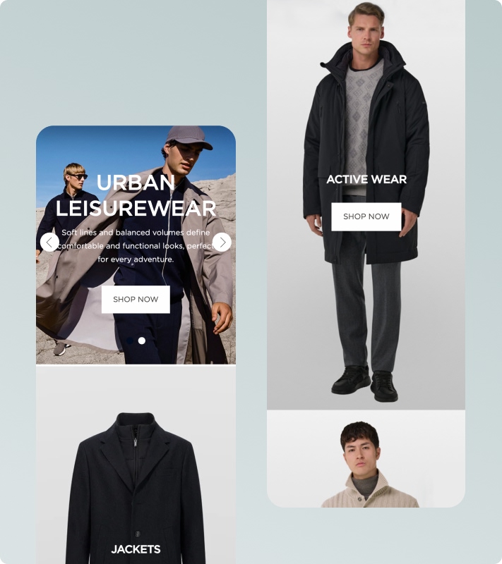
The final UI reflects a refined and modern aesthetic with product imagery taking center stage. Generous whitespace, subtle interactions, and structured layouts create a calm and confident browsing experience.
Product-first visual hierarchy \ Refined spacing system to enhance readability and luxury perception \ Subtle hover and transition effects to elevate interactivity \ Clear CTA hierarchy to guide conversion without visual aggression \ Modular layout system for scalable campaign integration \ Strategic use of contrast to highlight key actions
Responsive Design
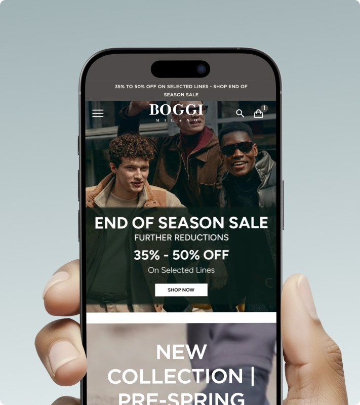
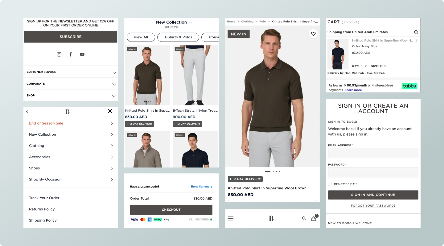
The responsive design approach ensured that the premium brand experience remained consistent across all devices. Adaptive layouts, optimized touch interactions, and performance-focused adjustments were implemented to provide a smooth and intuitive shopping journey, particularly on mobile where user engagement is highest.
Maintaining product image clarity across breakpoints \ Optimizing mobile navigation for one-hand usability Simplifying filter and sort interactions for smaller screens \ Clear and accessible checkout progression indicators
Final Outcome
The redesigned UAE e-commerce website delivers a premium, intuitive shopping experience aligned with Boggi Milano’s global brand standards while meeting regional user expectations. Created a seamless and premium digital shopping experience that strengthened brand perception and usability for the UAE market.
Consistency is critical in luxury digital experiences; minimal design requires strong hierarchy and restraint; mobile optimization plays a major role in conversion; clear structure enhances both usability and brand perception.