
Azadea Fashion and Lifestyle App
Azadea Group is a leading lifestyle retail company operating more than 40 international franchise brands across the Middle East and Africa. Since 1978, the group has built a diversified retail ecosystem spanning fashion, accessories, beauty, sports, home, and F&B. With over 14,390 employees, the company boasts a solid infrastructure overseeing more than 842 stores spread across 15 countries including Algeria, Bahrain, Ivory Coast, Cyprus, Egypt, Ghana, Jordan, Saudi Arabia, Kenya, Kuwait, Lebanon, Oman, Qatar, Iraq, and United Arab Emirates.

Project Overview
The Azadea Mobile App was developed as a centralized multi-brand e-commerce platform for the GCC region, enabling users to seamlessly browse and shop multiple international brands within a single mobile experience.
Problem Statement
Azadea operates multiple international brands under one retail ecosystem, each with distinct identities and product structures. The challenge was to design a unified mobile commerce experience that could support large-scale inventories, maintain brand flexibility, and deliver a seamless, high-conversion shopping journey tailored to GCC users.

User Experience Process
A structured research phase was conducted to understand the complexities of managing a multi-brand retail ecosystem within a single mobile platform. This included analyzing user behavior in mobile commerce, evaluating brand architecture, auditing product structures, and benchmarking leading regional and global retail applications.
Key insights
Users prioritize fast product discovery over brand exploration \ Overloaded category structures increase navigation friction \ Mobile shoppers expect minimal checkout steps \ Consistent UI patterns improve cross-brand usability \ Strong filtering and sorting capabilities directly impact conversion
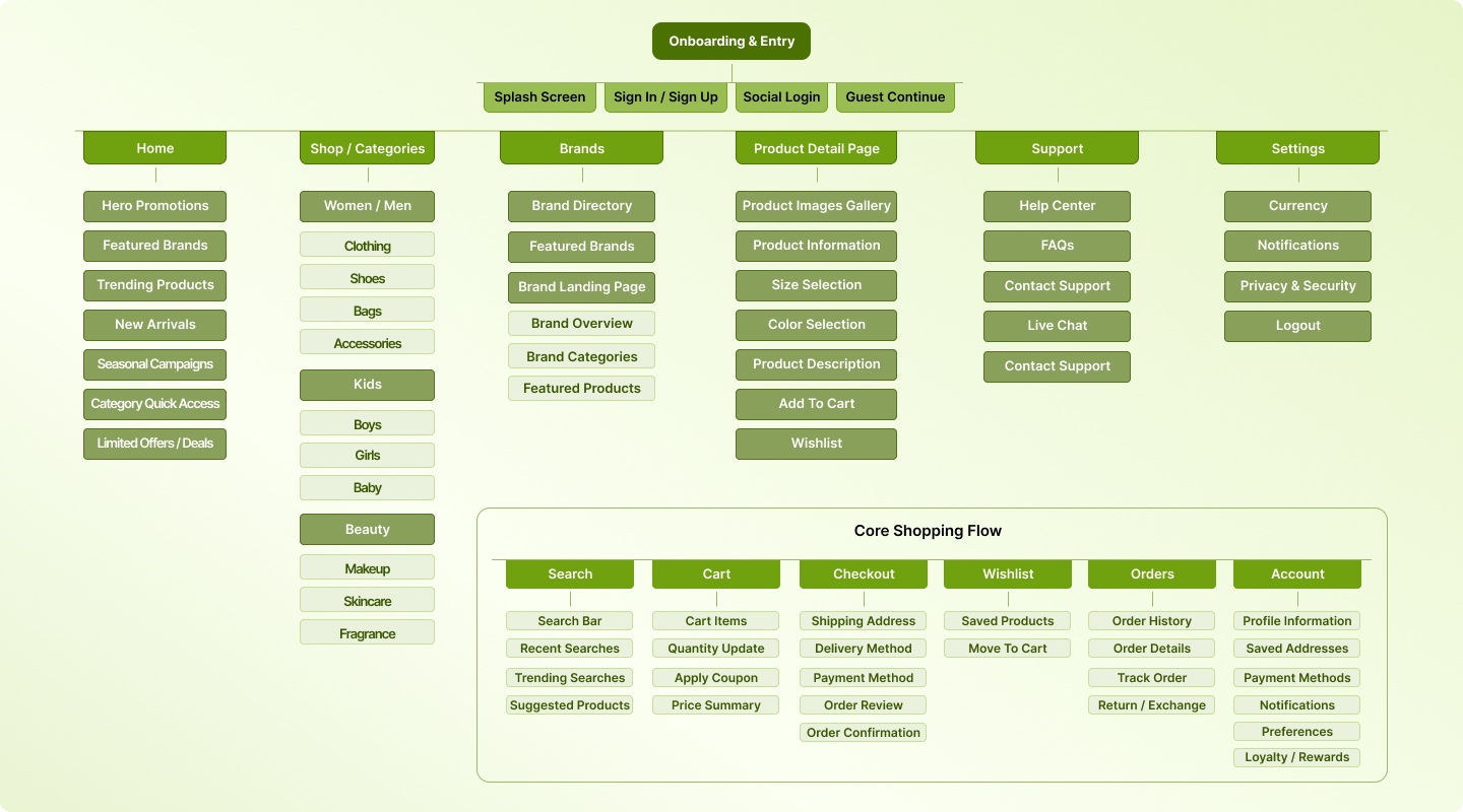
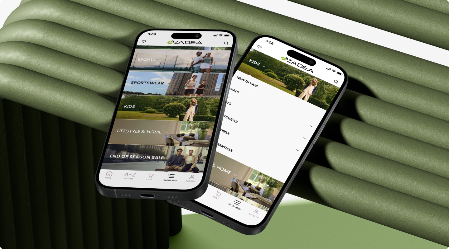
The information architecture was structured to support a complex multi-brand ecosystem while maintaining clarity, scalability, and intuitive mobile navigation. The focus was to simplify large product inventories into a seamless and logically organized user journey.
The architecture focused on
Clear separation between brand discovery and category browsing \ Simplified navigation for deep product hierarchies \ Scalable structure for future brand integrations \ Optimized product listing and filtering logic Reduced steps from discovery to checkout \ Logical grouping of account, cart, and transactional flows
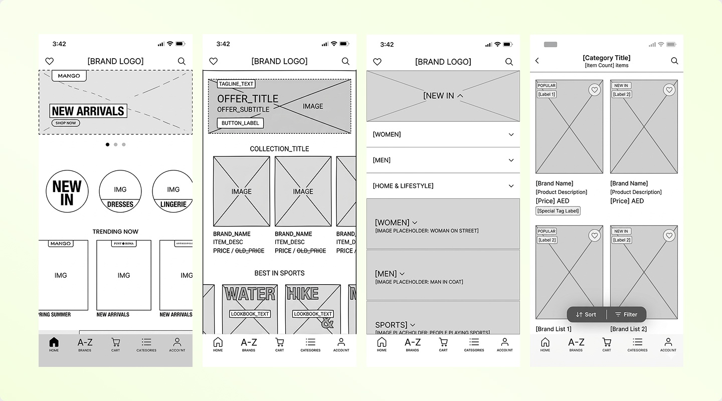
Low- to mid-fidelity wireframes were created to define layout structure, content hierarchy, and core user flows before moving into visual design. This phase focused on validating navigation patterns, reducing complexity, and ensuring a seamless end-to-end mobile commerce journey.
Wireframes covered
Onboarding & language selection flow \ Home screen layout and promotional modules \ Brand listing and brand landing structure \ Category navigation and subcategory hierarchy \Product listing with filtering and sorting \ Product detail page structure and variant selection \ Cart and checkout flow (multi-step process) \ Account management and order history
Design System
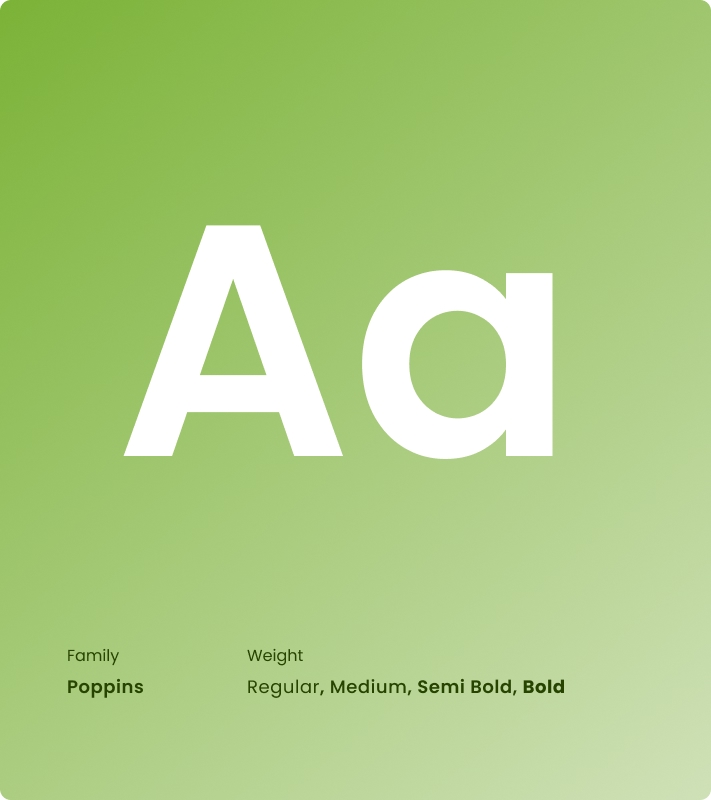
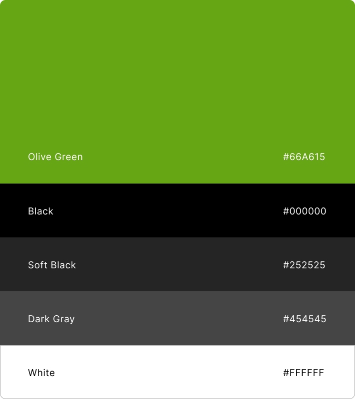
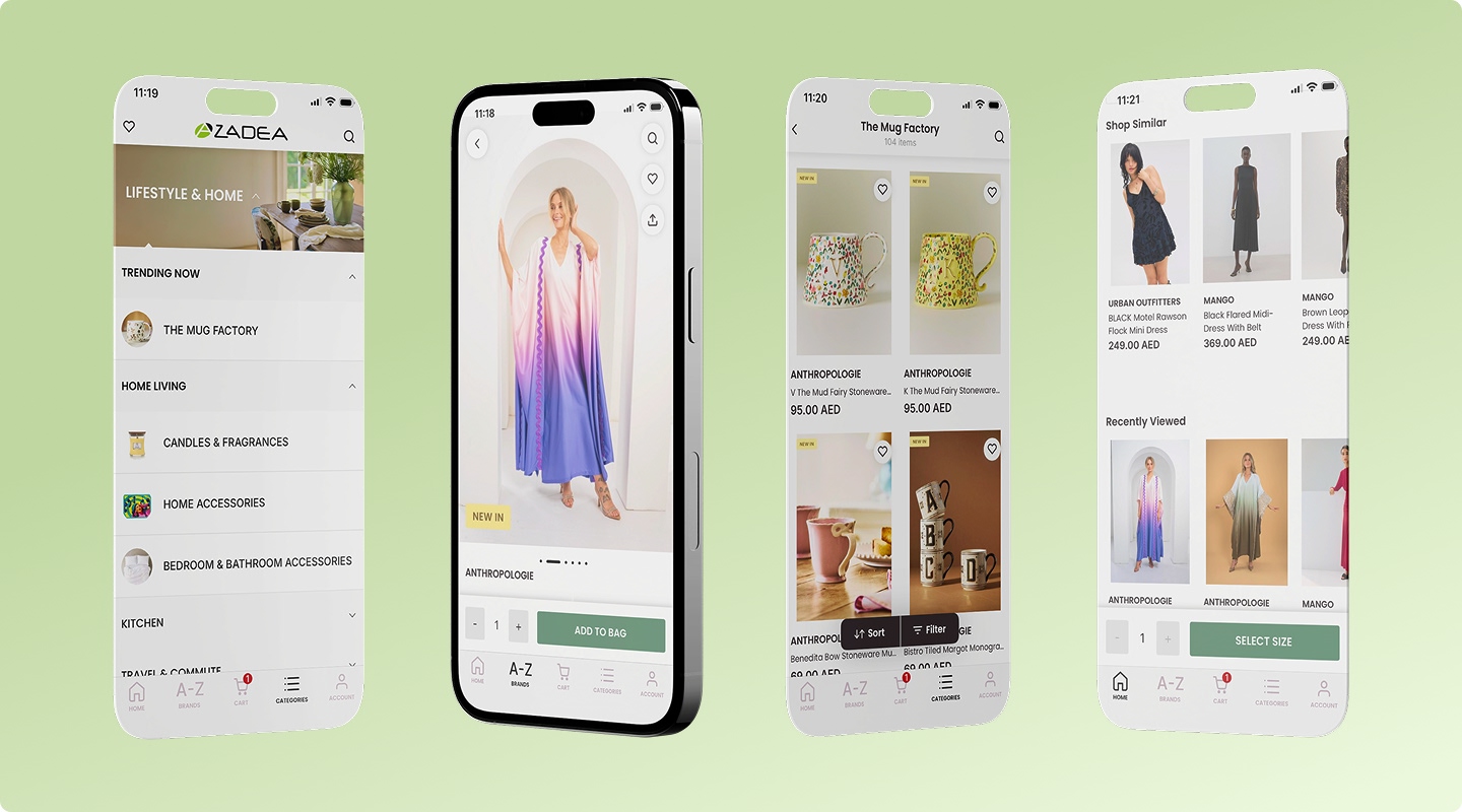
A scalable mobile design system was established to ensure visual consistency, efficiency, and long-term maintainability across multiple international brands. The system enabled structured design governance while allowing controlled flexibility for brand-specific elements.
Defined typography scale and hierarchy \ Token-based color system \ 8pt spacing and layout grid system \ Standardized button and CTA styles \ Product card components \ Filter and sorting modules \ Navigation patterns (bottom nav, headers) \ Form elements and input fields \ Badge system (Sale, New, Limited) \ Modal, bottom sheet, and alert components
UI Design
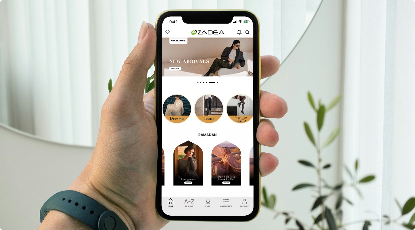
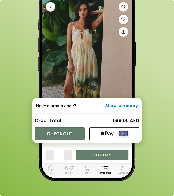
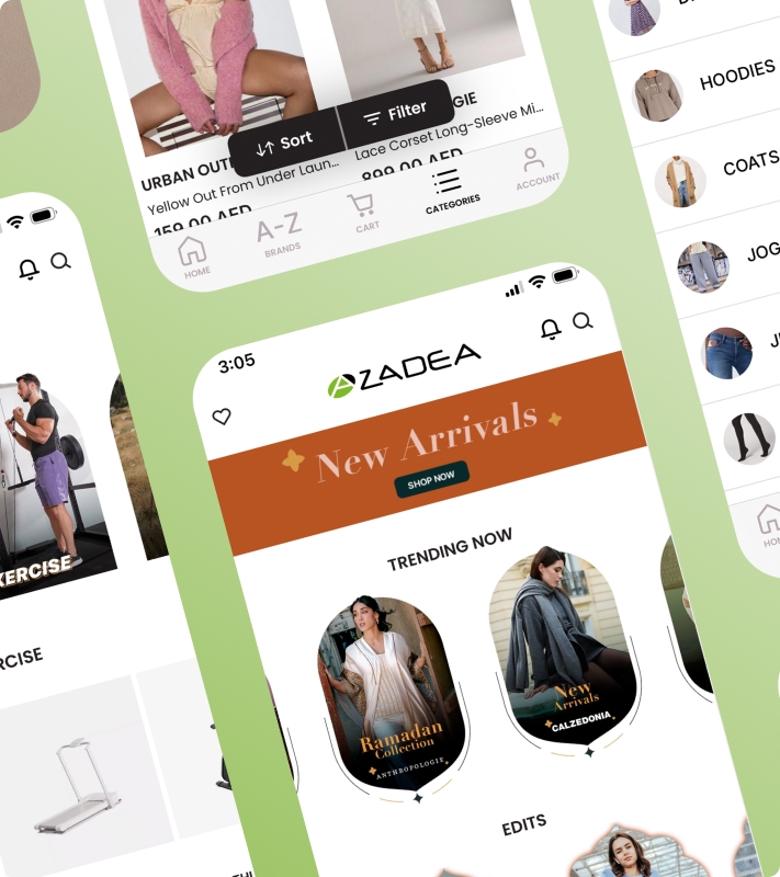
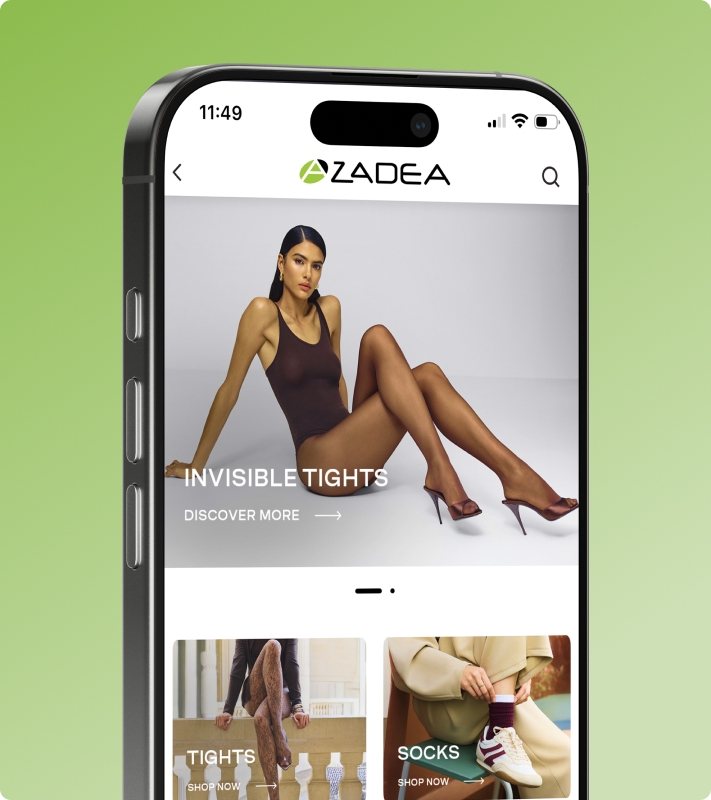
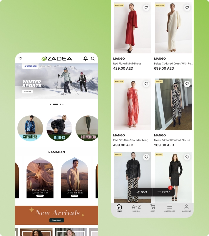
The UI design focused on delivering a clean, product-first mobile experience that balances brand flexibility with platform consistency. Emphasis was placed on visual hierarchy, clarity, and conversion-driven interface decisions to enhance the overall shopping journey.
Product-centric layouts with strong visual hierarchy \ High-contrast, conversion-focused CTA styling \ Clean grid system for improved content scanning \ Consistent iconography and micro-interactions \ Optimized spacing for mobile readability \ Clear differentiation between brands without visual clutter \ Structured filter and sorting UI for quick decision-making \ Minimal, distraction-free checkout interface
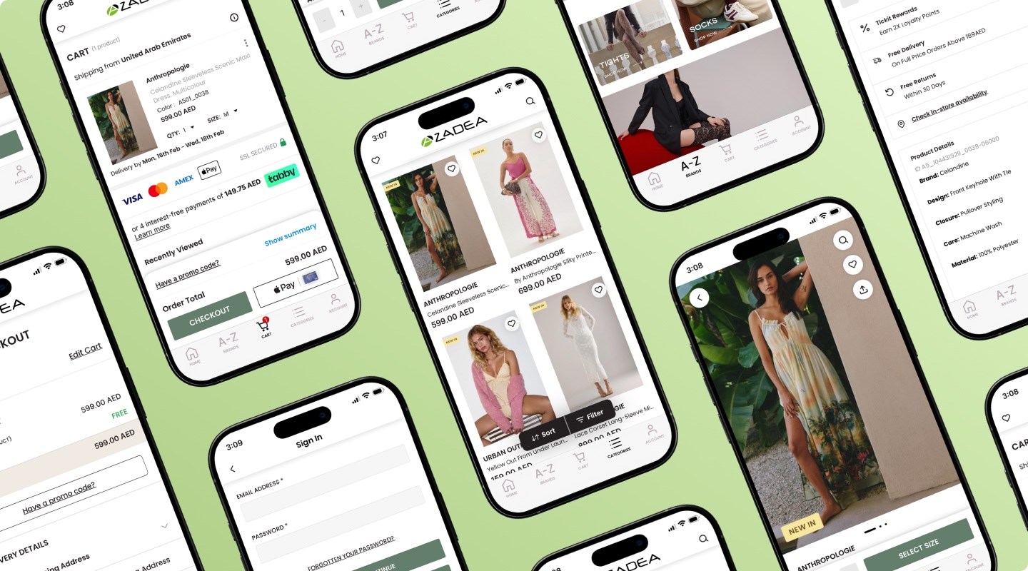
Final Outcome
The final solution delivered a scalable, unified multi-brand mobile commerce platform that simplifies product discovery and streamlines the checkout experience. The structured design system and optimized user flows established a strong foundation for future brand integrations while maintaining consistency, performance, and conversion-focused usability across the ecosystem.
Successfully unified multi-brand mobile ecosystem \ Improved product discovery flow \ Streamlined mobile checkout experience \Established scalable design governance \ Created a foundation for future brand integrations