
KIKO Milano
KIKO Milano is a globally recognized beauty brand rooted in Italian aesthetics, innovation, and self-expression. Known for making high-quality cosmetics accessible, the brand blends trend-driven creativity with advanced product development. With a strong focus on individuality and artistry, KIKO delivers the “Italian Art of Beauty” through expressive collections and personalized customer experiences.

Project Overview
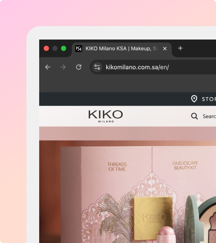
KIKO Milano is a globally recognized beauty brand rooted in Italian aesthetics, innovation, and accessibility. For the GCC region, the objective was to design a localized e-commerce experience that reflects KIKO’s vibrant brand identity while delivering a seamless and engaging shopping journey. The platform was tailored to regional preferences while remaining aligned with global brand guidelines.
Problem Statement
KIKO Milano required a localized GCC e-commerce platform that maintained global brand consistency while adapting to regional customer behavior, cultural nuances, and market expectations. The challenge was to balance a visually expressive beauty brand with usability, performance, and conversion-focused design.
User Experience Process
Product filtering and shade selection UX \ Visual merchandising patterns \ Campaign banner placement \ Conversion-focused checkout flows
Insights were used to refine layout structure, hierarchy, and content prioritization for the GCC market.
The design emphasizes
A clean and elegant interface that reflects KIKO Milano’s premium beauty identity \ Product-focused layouts to highlight cosmetics and beauty collections \ Clear visual hierarchy to support effortless product discovery \ Smooth browsing experience across categories and collections \ Strong promotional sections for campaigns and seasonal launches \ Consistent brand expression aligned with KIKO’s global design guidelines
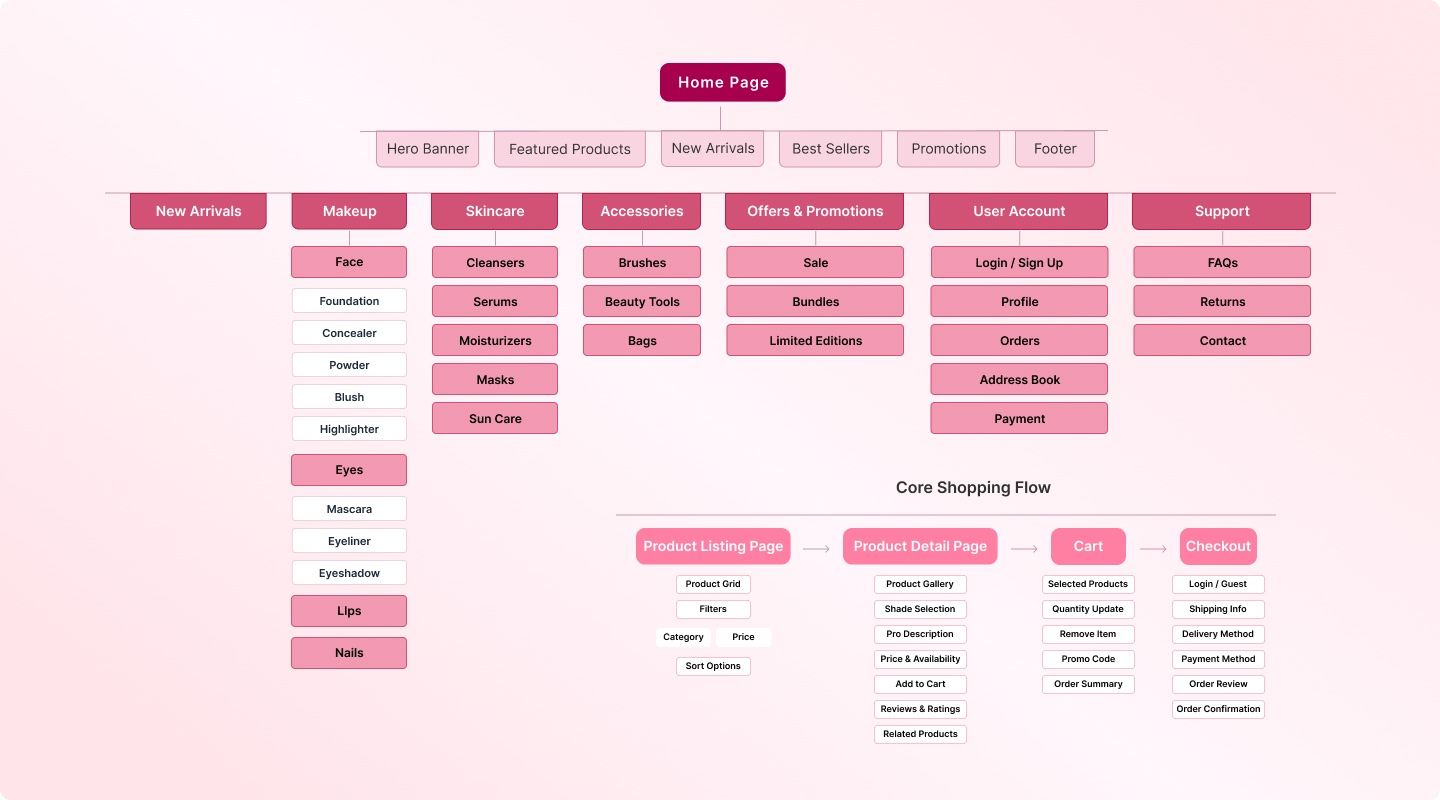
The information architecture was designed to prioritize discoverability while maintaining brand storytelling.
Primary structure included
Home \ New Arrivals \ Makeup Face, Eyes, Lips, Nails \ Skincare \ Accessories \ Offers & Promotions \ Product Detail Page \ Cart & Checkout \ Account \ Store Locator \ Support
The hierarchy ensures quick access to core product categories while supporting promotional campaigns and brand content.
The focus was on clarity, visual balance, and conversion efficiency before moving into high-fidelity design.
Wireframes covered
Homepage promotional layout structure \ Category listing (PLP) grid system \ Product detail hierarchy (imagery, swatches, reviews) \ Shade selection and product variation states \ Cart and checkout progression \ Account and order tracking flows \ Mobile navigation and filter interactions
Design System
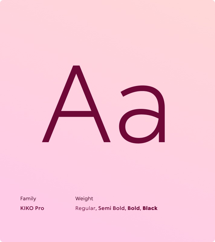
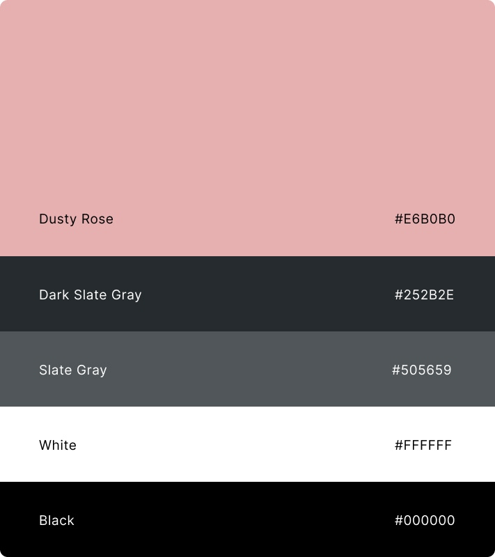
A flexible and scalable design system was developed to maintain KIKO Milano’s expressive brand identity while ensuring usability and consistency across the GCC platform. The system balances vibrant brand elements with structured layouts to prevent visual overload. A refined color palette built around soft pinks, warm neutrals, and high-contrast accents reinforces the beauty-focused aesthetic.
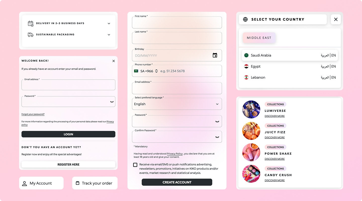
Soft pink and neutral tones aligned with KIKO’s beauty identity \ Clear typography hierarchy for product names, pricing, and descriptions \ Modular grid system for scalable campaign layouts \ Reusable UI components for product cards, swatches, filters, and forms \ Consistent CTA styling to maintain conversion clarity
UI Design
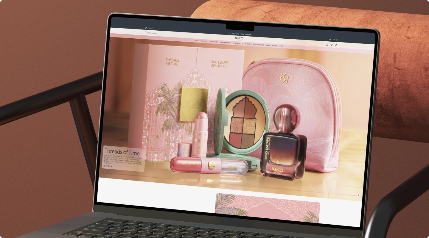
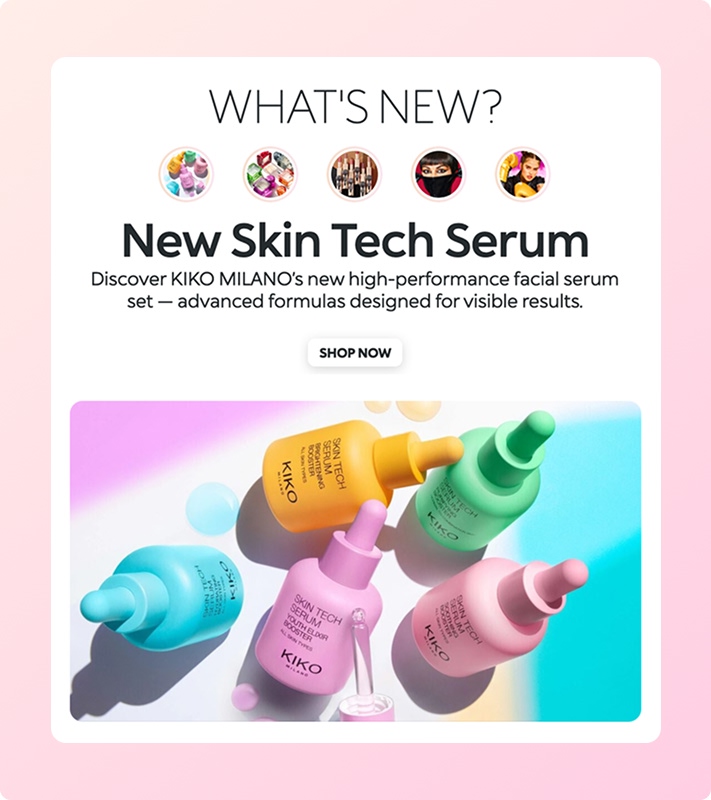
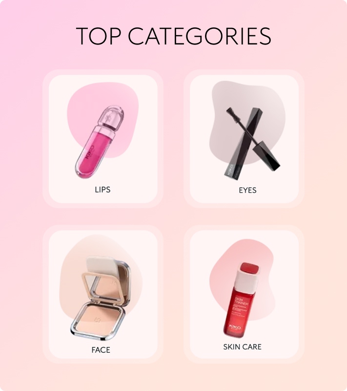
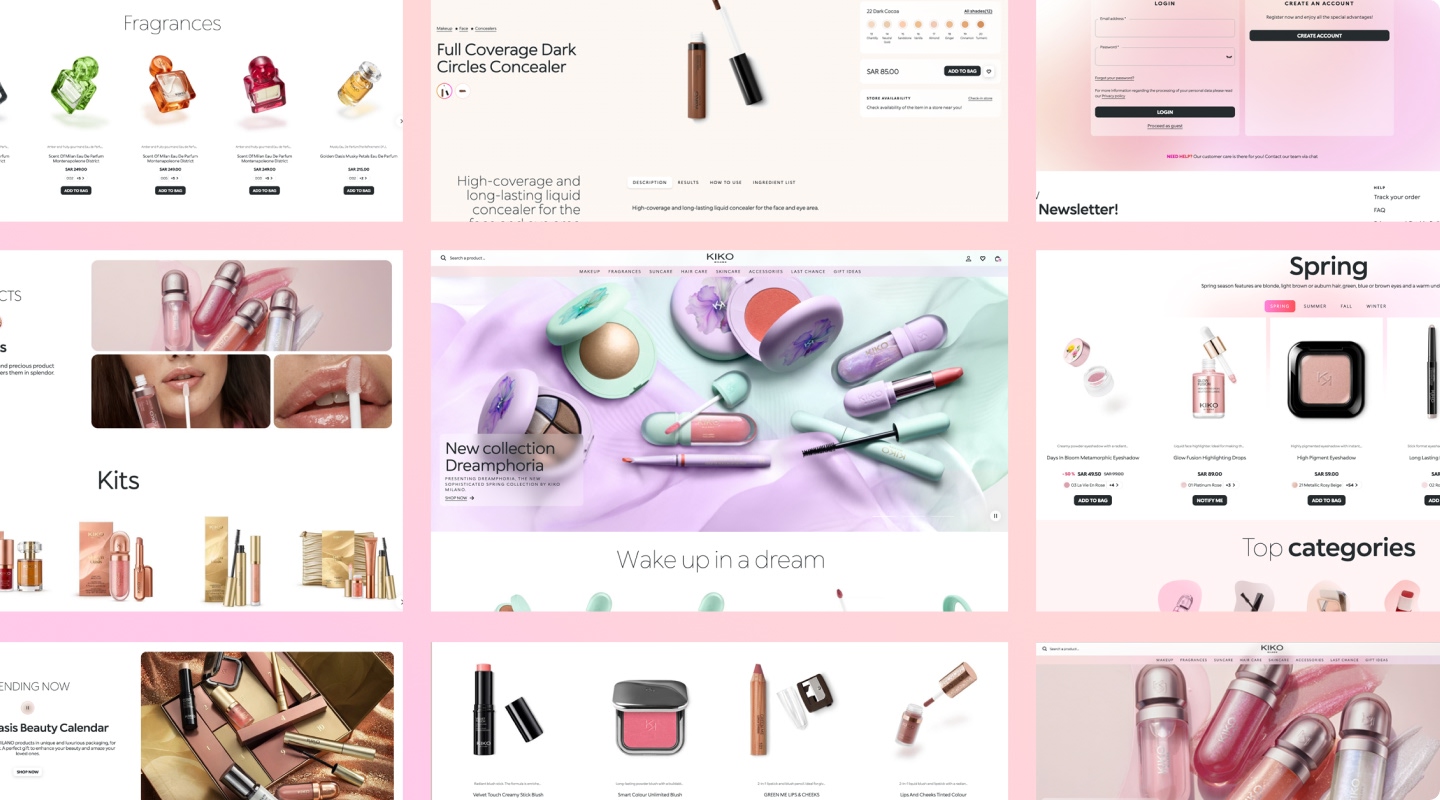
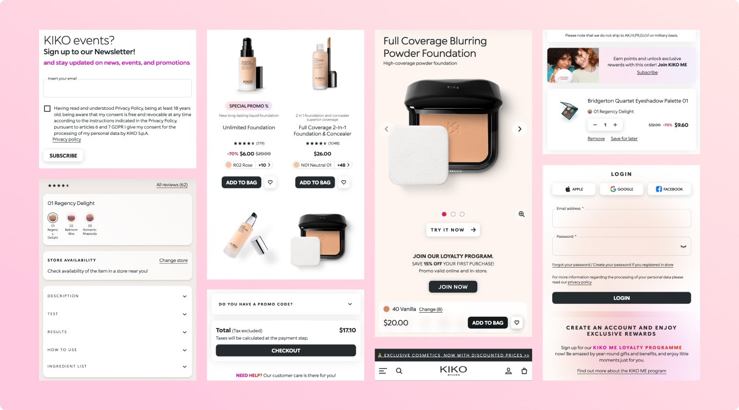
The final interface reflects KIKO’s expressive and trend-forward identity while maintaining clean usability. High-quality imagery, balanced white space, and structured layouts allow products to stand out without overwhelming the user.
The interface design reflects KIKO Milano’s modern and premium beauty identity through clean layouts, strong product visuals, and refined typography. The design prioritizes product presentation and promotional storytelling while maintaining a smooth and visually engaging shopping experience.
Responsive Design
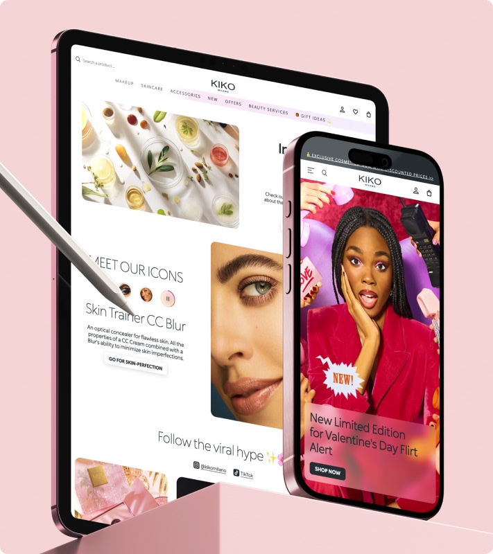
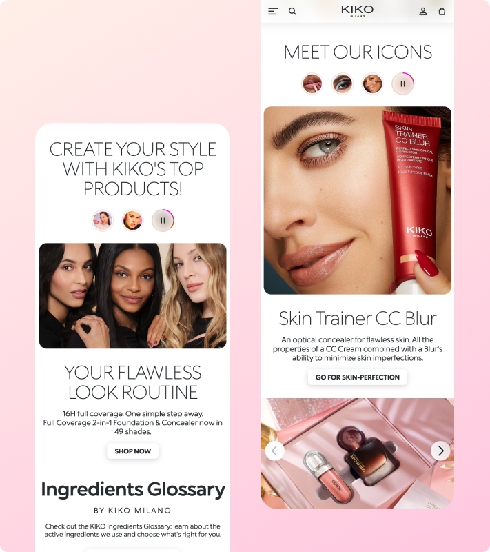
The website was optimized for a mobile-first audience, ensuring a seamless shopping experience across desktop, tablet, and mobile devices. Layouts were adapted to maintain visual hierarchy, readable product information, and smooth checkout interactions across screen sizes.
Touch-friendly shade and swatch selection \ Mobile-optimized filtering and sorting \ Sticky add-to-cart functionality on product pages \ Optimized image scaling for high-resolution beauty visuals \ Simplified mobile navigation drawer \ Performance optimization for image-heavy pages \ Maintaining promotional visibility without disrupting usability
Final Outcome
Delivered a localized, visually engaging e-commerce experience for the GCC market that aligns with KIKO’s global identity while enhancing product discovery and conversion performance.
Beauty e-commerce requires a strong visual hierarchy \ Shade and variant selection UX is critical for conversion \ Campaign integration must feel seamless, not intrusive \ Localization requires both visual and behavioral adaptation